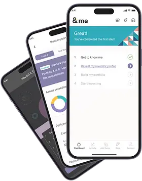


The launch of &me, a new consumer investment app, attracted a new audience to M&G Wealth.
the &me proposition
The &me app is a customised investment experience powered by Moneyfarm.
M&G Wealth wanted to open up its funds to a wider range of investors than previously captured through more traditional investment routes. Ease of use and free access to consultants were the selling points to focus on.
As Senior Product Designer, I created the end-to-end UX/UI experience - from onboarding to portfolio tracking to trading.
For native iOS and Android
For responsive web
A Two-Phased Design Project
Phase 1: Customise, optimise and launch the native mobile app
The first phase involved clarifying the scope of the customisation required based on the target user needs.
This included creating a new Look & Feel for the &me brand as well as a design system and illustration library.
The product was based on APIs from Moneyfarm and initially followed their onboarding flow and logic.
Most features and flows were customised to meet the unique requirements of &me.
Important opportunities were also identified from Moneyfarm's conversion data specifically within the onboarding flow.
The onboarding optimisation project to improve conversion became the major UX effort of Phase 1.
The MVP was launched with an optimised onboarding and fully customised experience in Jan 2023.
Phase 2: Build new functionality and launch the responsive web app
The second phase involved building new features. Joint accounts and the Buy and Sell of mutual funds, including multiple and monthly trades were brand new UX efforts, not supported by current APIs.
Additionally, the responsive web app was built and launched and improvement of the MVP was ongoing during Phase 2.
Phase 1: User and business goals
My first task was to establish who the target user was and tailor the customisation effort to that user.


Phase 1: Optimise the journey
A large element of the project was onboarding optimisation, as featured on Sky TV.
The tone and flow were honed based on prototype testing feedback.
app demo at 35 seconds
Address sign-up friction
As the product was built on Moneyfarm APIs and flows, some key drop-off points in the onboarding journey were well known - such as the sign-up hurdle.
Sign-up is necessary to create many financial projections, utilising sensitive and well-formed information.
We worked on a solution to give the customer value before commitment with a 'light' financial projection.
This solution measurably reduced sign-up drop-off.


Clarify risk & ease portfolio selection
Personal risk levels can be intimidating to users. Users confirm being labelled high or low can feel uncomfortable.
A prior approach had been assigning personality attributes such as 'Bold' to represent a risk level.
However, a lack of clarity on the connection between a personal risk level (personality) and a portfolio risk level (numeric value) can explain a drop-offs in portfolio selection.
A solution was to clearly label risk as High, Very High etc., and present a numeric scale and the user's place on it. At the same time, the visual presentation softens the experience using a temperature metaphor. This clearly connects portfolio match to personal risk level.
This approach improved the 'select-a-portfolio' conversion point.
Explain, encourage, reward
The onboarding experience was transformed through a focus on tone of voice. A behavioural psychologist was consulted to help with the communication approach.
Explain
We explain where the user is in the process and why they are asked for information. The tone is friendly and reassuring to build trust and confidence.
Encourage
We let the user know we understand we are asking a lot, but we're here to help and it's progressing well.
Reward
We communicate success when milestones are achieved.


Phase 1: Test and iterate
Several rounds of prototype testing were undertaken to validate onboarding optimisation decisions.
Lessons were learned for the immediate release as well as for the v2 release.


Phase 1: Create a brand experience
The brand perception of M&G Wealth needed a fresh approach to attract younger and more casual investors.
I worked closely with the creative lead at M&G Wealth to form a visual experience based on the building blocks of M&G Wealth, but re-imagined in new settings. I created an illustration library combining pure abstraction with figurative scenes. The abstract images served to reinforce the brand during functional procedures while figurative scenes aided in story-telling about risk levels and portfolio types.
I created and maintained a Figma design system including colour palette, web and native components and font set.
Phase 2: Create new features & a web app

Phase two focused on the creation and integration of new features such as Joint Accounts and XO Trading as well as creating the responsive web app.
The XO (execution only) Trading feature was a brand new requirement for the v2 release. I held workshops and worked closely with stakeholders to clarify requirements and plan its integration into the existing product.
I created several rough prototype versions of the Buy-and-Sell Mutual Funds journey which I tested on colleagues, stakeholders and guerilla-style.
At least 2 rounds of high-fidelity prototypes were also created - with a push towards simplification with every refinement.
Phase 2: Continuously improve
After the MVP launch in early 2023, we gathered feedback through journey analysis and Hotjar survey results.
Through user opinions and internal design refinement sessions, I continued to simplify the dashboard and carry this ethos through to new feature development such as the buy-sell trading journey.
The onboarding was also continuously re-visited as we added a new product stream and addressed user problems.


05 Measure impact
The &me investing platform continues to attract target users - younger investors in the accumulation phase of their financial lives.
The app has generated positive reviews from trade reviewers as well as from end-users on Trustpilot and the app stores.
The consistent themes are simple set-up and ease of use.


